
1. Navigation
2.0
There has been
long going debate on top vs bottom navigation, we will
finally sway towards the latter in 2019. Widespread adoption of these two UX
elements across iOS and Android will define this transition: Bottom
Sheetsand Swipe Up gestures.
Its a
known fact that users prefer using one thumb to
get things done
on mobile
phones. Ubiquity of large screen devices and one handed usage makes bottom of
the screen a prime real estate and appropriate for placing important
buttons within reach.
Bottom sheet: Designers now frequently prefer
bottom sheet for sub-flows, and instead of other components such as overflow
drop-downs, hamburger side-drawers and pop-up dialogues.

Having
two clear sections: content (top area) and navigation
(bottom area)as a practice across popular apps will standardise flows and
lower the cognitive load while increasing affordance for users. Both, Material
and HIG have included guidelines for bottom navigation in recent updates.
2. Interplay of
Voice and Visual interfaces
Voice interfaces (VUI)
is the next big thing in Human Computer Interaction (HCI). While visual and
voice interfaces have largely remained independent entities till now, 2019 will
see seamless integration of both and adoption at scale.
We
might or might not have the mic button on visual UIs. While
using an app, just speak when you feel like and the app will interpret it in
context. It is going to be transparent.
Driving
a car, answer a call by just saying “pick it up”, read a notification by saying
“read it for me”. Want to listen to a book while reading it, say “narrate this
chapter ”, or maybe “highlight last sentence” or “what does that mean”. Don’t
want to sort a lengthy scroll on a small screen, say “show me cheapest option
and the fastest option” or skip the whole flow by saying “find the cheapest
option and book it using my Amex”. When chatting, say “send uhhhhh”, or “share
live location for 30 mins”, easy!
Look
forward exciting products in this space, specially with localisation also
coming into the picture.
Mic UI in Google search, Whatsapp
and Prime music
3. Vernacular
is not only for content
As the world turns to
Next Billion Users, localisation will mean more than just content. It will
include copy, iconography, colors, UI metaphors, and UX flows and features.
For
example, for vernacular user base FB has english UI but juxtaposes local
copy for “What’s on your mind”, PayTm provides localised UI for
each language, and Sharechat hides a feature (adult content)
for certain languages. Google Tez (now Google Pay) was fundamentally built for
local users and focussed on building Digital Trust using
explicit messaging, simple flows and minimal features.
In one of the recent user studies in a tier 3 city in
Tamil Nadu, our users preferred local metaphors like namaste, garland etc
instead of “like” for appreciating something. Imagine it from one user’s
perspective. Unlike many, she is new to internet. Her perception is restricted
to her context (local) and learning curve (for english) is high for her. She
will not be able to use a product unless its tailored for her.
There
are many examples of how apps are increasingly accommodating multiple languages
in products. Vernacular targeting will require designs to factor in this
variable, whether at content level, or UI, or UX, or at product level is
dependent on the case.
Screengrabs of Google Pay in
Gujarati, Sharechat in Punjabi and PayTM in Hindi
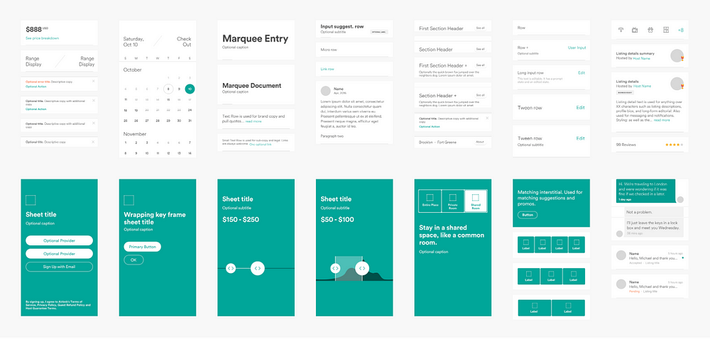
4.
Design Systems
Two main design systems: Material on
android and Human Interface Guidelines on
iOS are widely incorporated in apps. These systems provide guidelines for
commonly used components such as headers, cards, bottom sheets et. al. Code
libraries of these components are also easily available. Additionally, users
are also used to these components and layouts.
However,
customisation of these design systems are on the rise. While popular apps like
Whatsapp, FB, Twitter prefer nativity with minor customisations, many apps such
as Uber, Airbnb, IBM, Snapchat, iOS Music have taken a more
liberal approach. Uber’s bottom sheet in fact was an influential success.
Accordingly, Material and iOS have also updated their systems to be more
flexible instead of being prescriptive.
Even
amongst smaller startups, design systems are becoming a norm as it complements
the contemporary org structure with a centralised design infra team and a pod
based product-design resource allocation.
2019
will see:
1. Larger adoption of design systems amongst companies.
2. Liberal customisation of design systems as companies
target new geographies where users have less exposure to default systems.
Quick
tip: code the components; and update the design system frequently
as per newer use cases and industry trends.
Comments
Post a Comment